HempWood Rebrand
Navigating the leap from startup to luxury, HempWood needed a cohesive identity to resonate with high-end residential, commercial, and government buyers. We partnered to develop a comprehensive brand guide, defining design principles, tone of voice, and key messaging, ensuring every touchpoint communicates their premium, sustainable promise and equips sales teams to win new projects.
The Challenge
HempWood’s early branding spoke to its startup roots but lacked the sophistication and consistency needed to compete in the luxury flooring and finishes market. Key opportunities included:
Voice & Design Consistency
Varied messaging and visual styles across channels diluted brand impact.
Positioning Gap
The narrative didn’t emphasize HempWood’s unique blend of sustainable performance and premium quality.

Sales Enablement Needs
Sales and marketing teams lacked a unified toolkit to confidently present the brand to high-end residential and commercial buyers.

The Idea
Elevate HempWood’s positioning by establishing a robust brand guide that translates their sustainability leadership into a luxury experience. By defining design principles, tone and voice, and key messaging pillars, we ensured that every brand asset, digital or print, consistently communicated their premium, eco-conscious identity.

Our Approach
Brand System Implementation
We collaborated with HempWood stakeholders to author a detailed guide outlining visual hierarchy, usage guidelines for typography and photography, iconography standards, and a comprehensive tone-of-voice framework, including vocabulary dos and don'ts, to maintain a consistent brand experience across proposals, digital interfaces, and physical collateral.
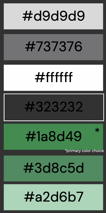
Refined HempWood Color Palette
We developed a rich, earthy palette centered on HempWood’s signature forest green and warm timber brown, complemented by fresh leaf-lime accents and clean neutrals. This system ensures every sales asset feels unmistakably HempWood — grounded in sustainability yet vibrant enough to cut through inbox clutter.

Key Messaging Pillars
Defined three core messaging pillars: "Organic Flooring," "Healthier Spaces," and "Made in the U.S." to anchor every headline, subhead, and supporting concept in a way that resonates with architects, designers, and facility managers across luxury, commercial, and government markets.
Design Principles
Defined principles such as "Simplicity with Substance" and "Textural Authenticity" that guide layout decisions, imagery selection, and material choices, ensuring every touchpoint feels intentional and premium.
Toolkit Implementation
Developed templated sales decks, one-pagers, and digital assets (email headers, social post templates) consistent with the guide. Conducted hands-on workshops with sales and marketing teams to embed these tools into their workflows.
Takeaways for Company Rebrands
Voice and design consistency
A unified brand guide is critical when transitioning from startup to luxury market—ensuring consistency and confidence in every pitch.
Our Role
Design
Art Direction
Visual Design
Motion Design
Creative Direction
Access to empowering resources
Defining tone and voice alongside visual standards empowers teams to communicate complex benefits simply and compellingly.
Strategy
Integrated Marketing Strategy
Content Strategy
Social Strategy
Audience Research
Design Optimization
Embedding design principles into daily workflows accelerates output quality and strengthens brand recall among discerning audiences.
Content
Copy Writing
Video Production
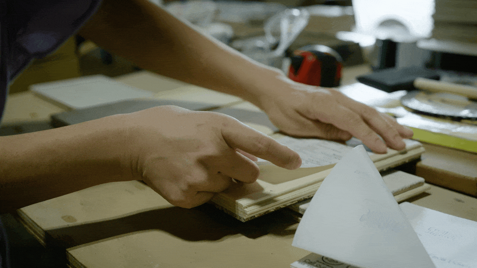
Photography Production
Post Production
Sound Design
Music Production